Creating my own book cover trend to suit the story, and with the current trends for genres like a romantic comedy, I wanted to flip that cover trend.
The quick story on book cover trends:
Book covers are what first grab the reader’s attention.
They’re a marketing tool, that has come a long way when first created to simply protect the manuscript, as explained here in this article.
So book cover trends are created to go with the times.
In the past some book cover trends went through Ptsd-triggering-trends the same way fashion trends go in cringe-worthy cycles. I’m talking about you Mullets! It’s as bad as jumpsuits for men.
In recent times, we have animated images currently gracing romantic book covers that an author-friend labelled as the reborn trend of 80s clipart. While YA covers are detailed amazing artworks.
How come they get that kind of attention when contemporary rom-com covers skip all that? It’s either shirtless men or minimal animated images.
If you take a step back from the bookshelf, some of those animated book covers seem to be something inbetween children’s picture books and comic books. No offence to those who do have these sorts of covers.
I wanted a book cover with a look-at-me entrance.
I wanted the kind of book cover that made people slow their scroll to see if this story would suit their reading tastes.
Nor, did I want the same stock image or cover models shared on other romance covers. I have a few of those already.
I needed something beyond the generic covers, without being corny and cute, while still staying true to my genre. (That happens to be a blend of a few genres!)
The challenge was on!
This book is more than a romance.
It’s more than a romantic comedy.
It’s more than drama.
It’s more.
So it needed more on the cover, in hope of attracting an Amazon Movie deal, where I’m already picturing who the cast will be, and what I’ll be wearing on the red carpet opening night. We can all dream, right?
Pass the buttered popcorn, and let’s talk about little budgets for a big story…
So, I sent out a load of requests for quotes from professional book cover designers. This new book deserved it.
Then while waiting, I grabbed the buttered popcorn and started to aimlessly scroll book cover trends on Goodreads, then over to Instagram.
The first of the design quotes came through…
Holy-moly-batman-needs-new-leathers!
I could spend seven days lying beside a pool in a Bali five-star resort, having daily massages, in between stocking up on three years worth of Christmas shopping, for that kind of cash these designers were after.
Or…
We take a trip to the twilight zone!
Searching for answers on social media….
Boom. A little ad hit me.
One of those pesky ads you see scrolling and ignore all the time in the main feed.
Except, this one sang like a chorus of angels!
It was about photomontage.
Photomontage is what book cover art is all about.
Photomontage is a combination of several photographs joined together to create an artistic effect or one image.
As a fumbling DIY backyard photographer, it was love at first sight.
Photomontage allowed me to gather a group of photos, I took, to blend them into the one image.
Some of the practise ones, I’ll spare your eyesight with that, but it’s like this image I made below…
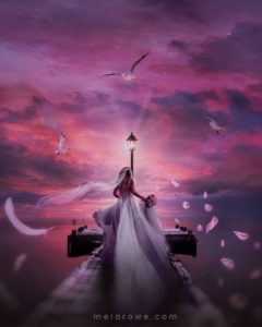
Inspiration takes over the humble home!
Forget the housework, and things like feeding the children, there was a new craft obsession in town. I took courses, practised, fumbled, fudged, oohed and ahhed over countless tutorials with buttery-popcorn-fingers, as I studied the art of photomontage.
I only have the basics, but what it did for me, allowed me to produce my vision for a book cover my way.
Many will tell you to NOT do your covers. But I say, if you can, why not.
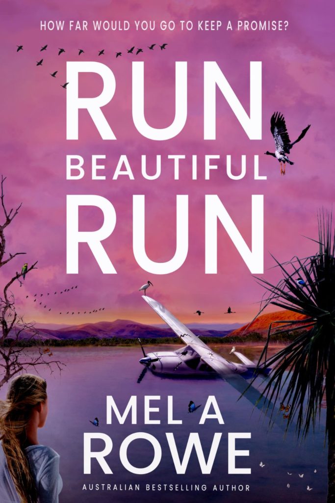
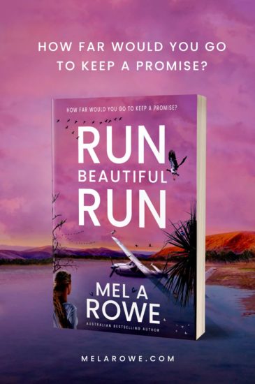
With the art of photomontage, I turned my images (that you can find on my Instagram feed) and blended them all into one image.
The result speaks volumes—I hope.
The background is a local billabong, the foreground is from a local dam, and the birds are regular stalkers. Oh, wait, could those birds class me as their stalker while I’m out with my camera?
But the result is a tour of the northern Territory outback billabong, blended into one.
And it suits the story, Run Beautiful Run.
Read the book and tell me if you agree.
**All still images relating to this post’s topic are via CANVA.com
Do check it out for all your graphic and social media needs.
| #Escape2HEA ~ because everyone deserves an Escape from the drama in their day!


